In this post, we mainly studied the violent crime rates and property crime rates.
First, we read the necessary tables.
library(tidyverse)## -- Attaching packages --------------------------------------- tidyverse 1.3.0 --## √ ggplot2 3.3.3 √ purrr 0.3.4
## √ tibble 3.0.5 √ dplyr 1.0.3
## √ tidyr 1.1.2 √ stringr 1.4.0
## √ readr 1.4.0 √ forcats 0.5.0## -- Conflicts ------------------------------------------ tidyverse_conflicts() --
## x dplyr::filter() masks stats::filter()
## x dplyr::lag() masks stats::lag()library(readxl)
table_1 <-
read_excel(here::here("dataset/table-1.xls"))
unemployment_rates <-
read_excel(here::here("dataset/unemployment_rate.xlsx"))Then, we plot the violent crime rates from years 2000 to 2019.
ggplot(table_1) +
  geom_point(aes(x = year, y = violent_crime_rate))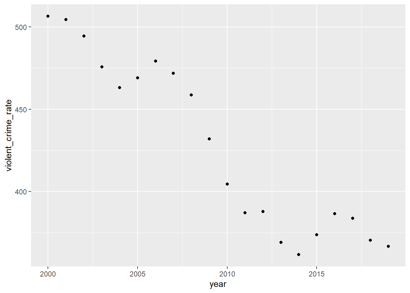
According to the plot, the violent crime rate is the highest around year 2000. After then, the overall violent crime rate is decreasing from 2000 to 2019. There were a couple of increases throughout the years (from 2004 to 2006 and from 2014 to 2016), but the crime rate always went back down.
We make plots to observe how the different violent crime rates, including murder and non-negligent manslaughter, rape (both in revised and legacy definition), robbery, and aggravated assault, changed over the last 20 years.
(table_1_violent_rate <-
   table_1[c(1, 6, 8, 10, 12, 14)])
## # A tibble: 20 x 6
## year murder_and_nonn~ rape_revised_de~ rape_legacy_def~ robbery_rate
## <dbl> <dbl> <dbl> <dbl> <dbl>
## 1 2000 5.5 NA 32 145
## 2 2001 5.6 NA 31.8 148.
## 3 2002 5.6 NA 33.1 146.
## 4 2003 5.7 NA 32.3 142.
## 5 2004 5.5 NA 32.4 137.
## 6 2005 5.6 NA 31.8 141.
## 7 2006 5.8 NA 31.6 150
## 8 2007 5.7 NA 30.6 148.
## 9 2008 5.4 NA 29.8 146.
## 10 2009 5 NA 29.1 133.
## 11 2010 4.8 NA 27.7 119.
## 12 2011 4.7 NA 27 114.
## 13 2012 4.7 NA 27.1 113.
## 14 2013 4.5 35.9 25.9 109
## 15 2014 4.4 37 26.6 101.
## 16 2015 4.9 39.3 28.4 102.
## 17 2016 5.4 40.9 30 103.
## 18 2017 5.3 41.7 30.7 98.6
## 19 2018 5 44 31 86.1
## 20 2019 5 42.6 29.9 81.6
## # ... with 1 more variable: aggravated_assault_rate <dbl>pivotl_table1_violent <-
table_1_violent_rate %>%
pivot_longer(-year, names_to = "violent_crime", values_to = "violent_crime_rate")
ggplot(pivotl_table1_violent,
aes(x = year, y = violent_crime_rate, fill = violent_crime)) +
geom_area()## Warning: Removed 13 rows containing missing values (position_stack).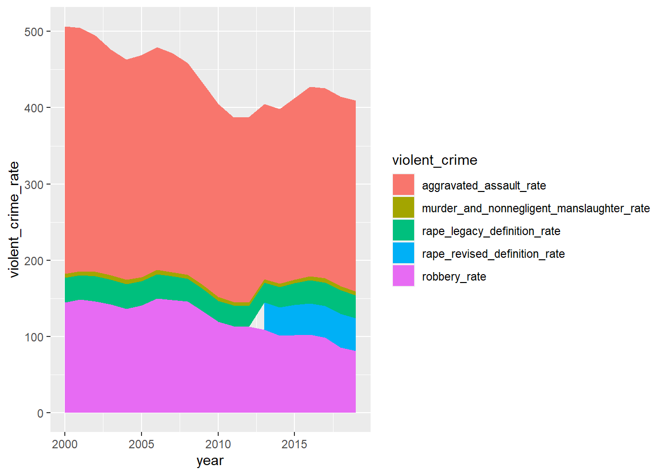 Based on the graph, we can see the most common violent crime is aggravated assault. After that is robbery, rape and murder and non-negligent manslaughter respectively. The rate of violent crimes has decreased in overall and so has aggravated assault and robbery. To start with, rape, and murder and non-negligent manslaughter are less common. Besides, the rates of rape and murder and nonnegligent manslaughter over the years have stayed relatively the same based on the graph.
geom_area() reference:
“How can I get my area plot to stack using ggplot?.” stack overflow, https://stackoverflow.com/questions/45730991/how-can-i-get-my-area-plot-to-stack-using-ggplot. Accessed 26 March 2021.
Here are more detailed plots of each violent crime.
ggplot(pivotl_table1_violent, aes(x = year, y = violent_crime_rate)) +
  geom_point() +
  geom_line() +
  facet_wrap(~violent_crime)
## Warning: Removed 13 rows containing missing values (geom_point).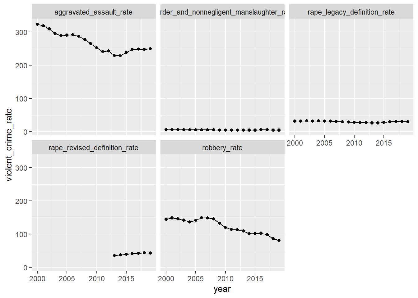 From these graphs above, we can see more clearly about the crime rates of murder and non-negligent manslaughter, rape, robbery, and aggravated assault.
Then, we plot the property crime rates from 2000 to 2019.
ggplot(table_1) +
geom_point(aes(x = year, y = property_crime_rate))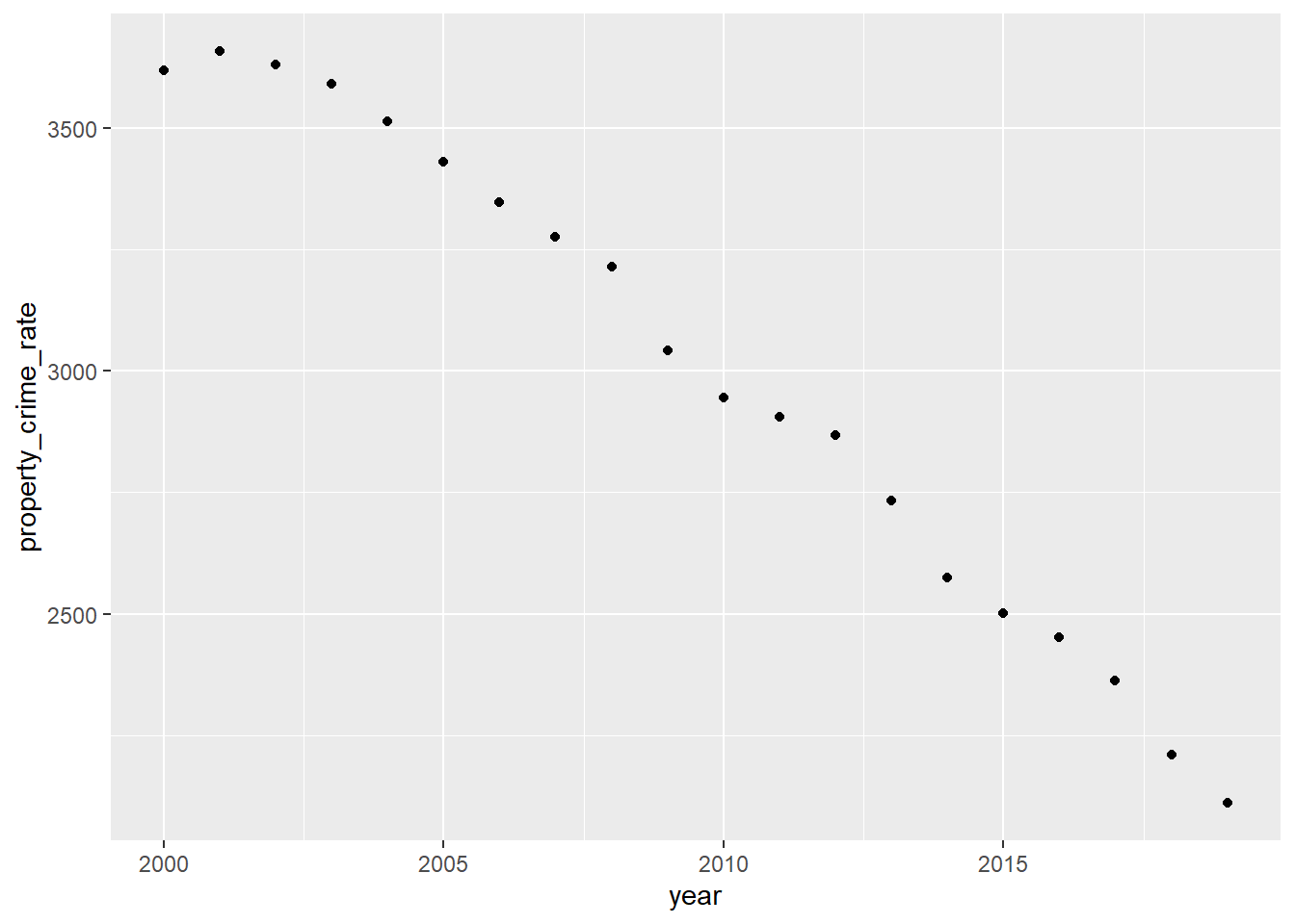 From the graph, we can see that property crime rates have decreased over the years, with the exception from 2000 to 2001, where there was an increase.
Next, we also make plots to observe how the different property crime rates, including burglary, larceny theft, and motor vehicle theft change over the last 20 years.
(table_1_property_rate <-
   table_1[c(1, 18, 20, 22)])
## # A tibble: 20 x 4
## year burglary_rate larceny_theft_rate motor_vehicle_theft_rate
## <dbl> <dbl> <dbl> <dbl>
## 1 2000 729. 2477. 412.
## 2 2001 742. 2486. 430.
## 3 2002 747 2451. 433.
## 4 2003 741 2416. 434.
## 5 2004 730. 2362. 422.
## 6 2005 727. 2288. 417.
## 7 2006 733. 2213. 400.
## 8 2007 726. 2185. 365.
## 9 2008 733 2166. 315.
## 10 2009 718. 2064. 259.
## 11 2010 701 2006. 239.
## 12 2011 701. 1974. 230
## 13 2012 672. 1965. 230.
## 14 2013 610. 1902. 221.
## 15 2014 537. 1822. 215.
## 16 2015 495. 1784. 222.
## 17 2016 469. 1745. 237.
## 18 2017 430. 1696. 238.
## 19 2018 378 1602. 230.
## 20 2019 340. 1550. 220.pivotl_table1_property <- table_1_property_rate %>%
pivot_longer(-year,
names_to = "property_crime", values_to = "property_crime_rate")
ggplot(pivotl_table1_property,
aes(x = year, y = property_crime_rate, fill = property_crime)) +
geom_area()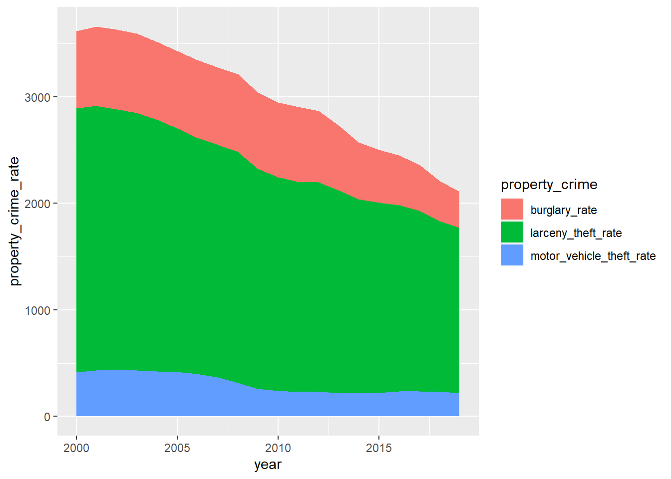 Based on this graph, we can see the most common property crime is larceny, and then burglary and motor vehicle theft respectively. For the most part, all of the property crimes are seen to be decreasing over the last few years. For a couple of years, there seems to be a rise in burglary and motor vehicle theft, but only by a little, barely visible if the plot is not looked at carefully.
geom_area() reference:
“How can I get my area plot to stack using ggplot?.” stack overflow, https://stackoverflow.com/questions/45730991/how-can-i-get-my-area-plot-to-stack-using-ggplot. Accessed 26 March 2021.
Here are more detailed plots of property crimes.
ggplot(pivotl_table1_property, aes(x = year, y = property_crime_rate)) +
geom_point() +
geom_line() +
facet_wrap(~property_crime)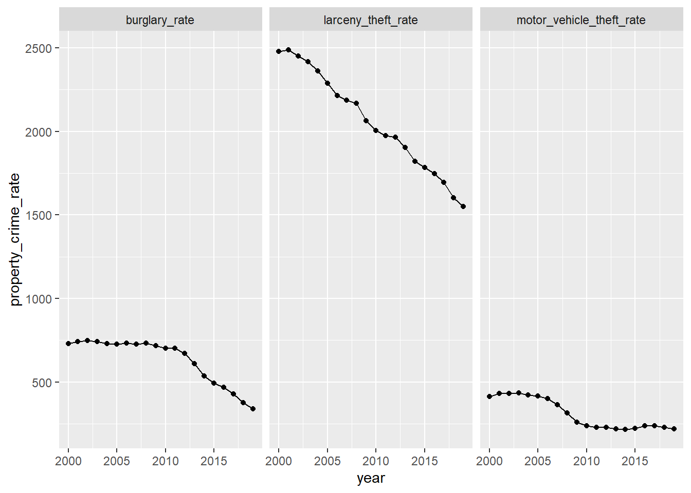 Basically, the detailed plots match what the general plot expresses.
Finally, We want to find if there are some relationship between unemployment rate and crime rates. We expect that the larger the unemployment rates are, the bigger the violent crime rates and property crime rates are.
unemployment_rates %>%
mutate(average_rates = (Jan + Feb + Mar + Apr +
May + Jun + Jul + Aug +
Sep + Oct + Nov + Dec) / 12) %>%
ggplot() + geom_point(aes(x = year, y = average_rates)) +
geom_line(aes(x = year, y = average_rates))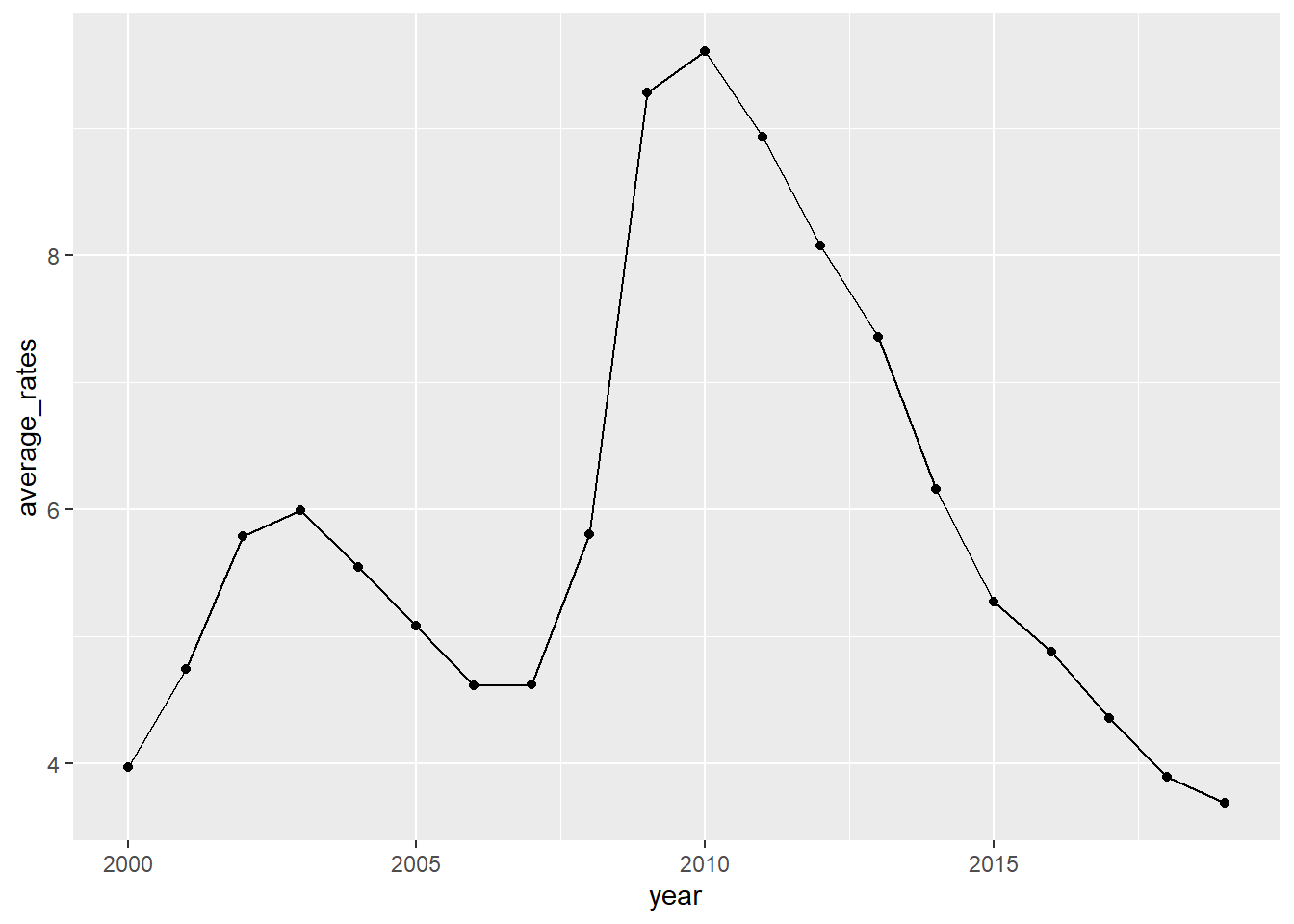 From the plot, we can see that the unemployment rates increased from 2000 to 2003, and from 2007 to 2010, decreased from 2003 to 2006, and from 2010 to 2019. However, violent crime rates have decreased from 2000 to 2003 and from 2007 to 2010. From 2003 to 2006, the violent crime rate first decreased but then increased. Besides, during the period from 2010 to 2019, the violent crime rate actually once experienced an increase. For property crime rate, it had a little increase during the period from 2000 to 2003 but then decreased, and it decreased from 2007 to 2010. Besides, property crime rate decreased both from 2003 to 2006 and from 2010 to 2019. Overall, when it comes to violent crime rate, we can see that it actually does not vary along with the unemployment rates in the direction that we expect. For property crime rate, its variation from 2003 to 2006 and from 2010 to 2019 along with the unemployment rate is what we expected.
Reference:
“Databases, Tables & Calculators by Subject.” U.S. Bureau of Labor Statistics, https://data.bls.gov/timeseries/LNS14000000?years_option=all_years. Accessed 19 March 2021.
“How can I get my area plot to stack using ggplot?.” stack overflow, https://stackoverflow.com/questions/45730991/how-can-i-get-my-area-plot-to-stack-using-ggplot. Accessed 26 March 2021.
“Table 1.” FBI:UCR, https://ucr.fbi.gov/crime-in-the-u.s/2019/crime-in-the-u.s.-2019/topic-pages/tables/table-1. Accessed 19 March 2021.